Giftin

End to End Application

UX case study

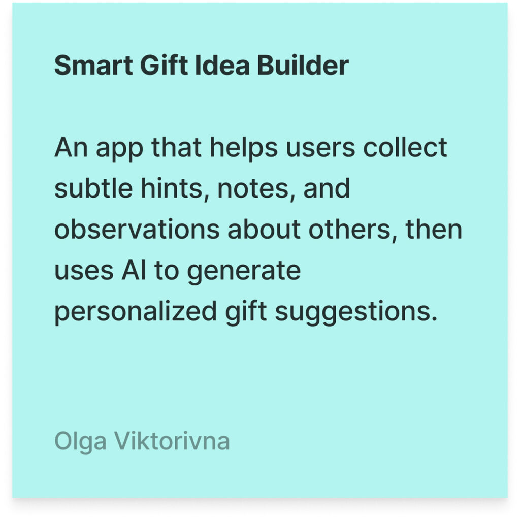
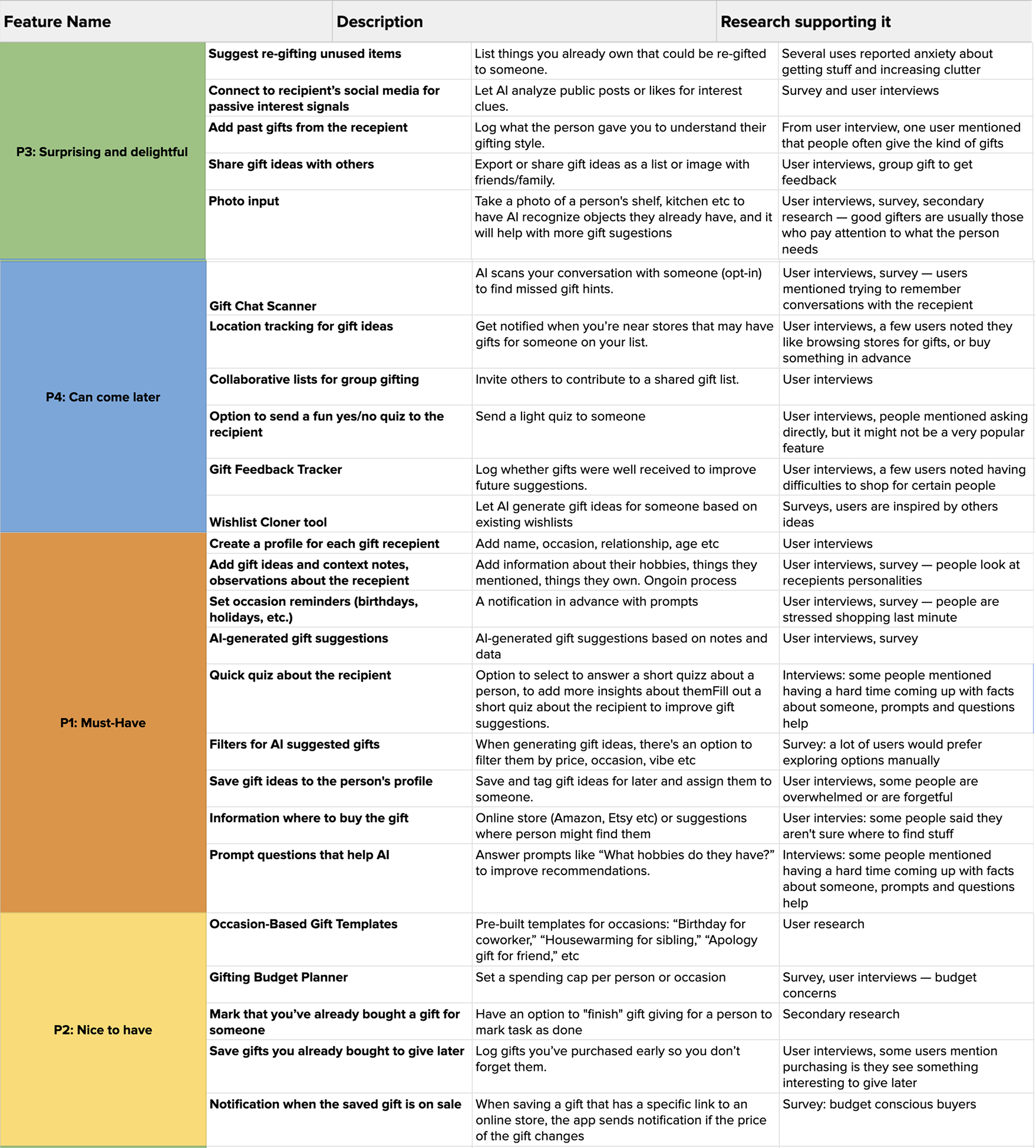
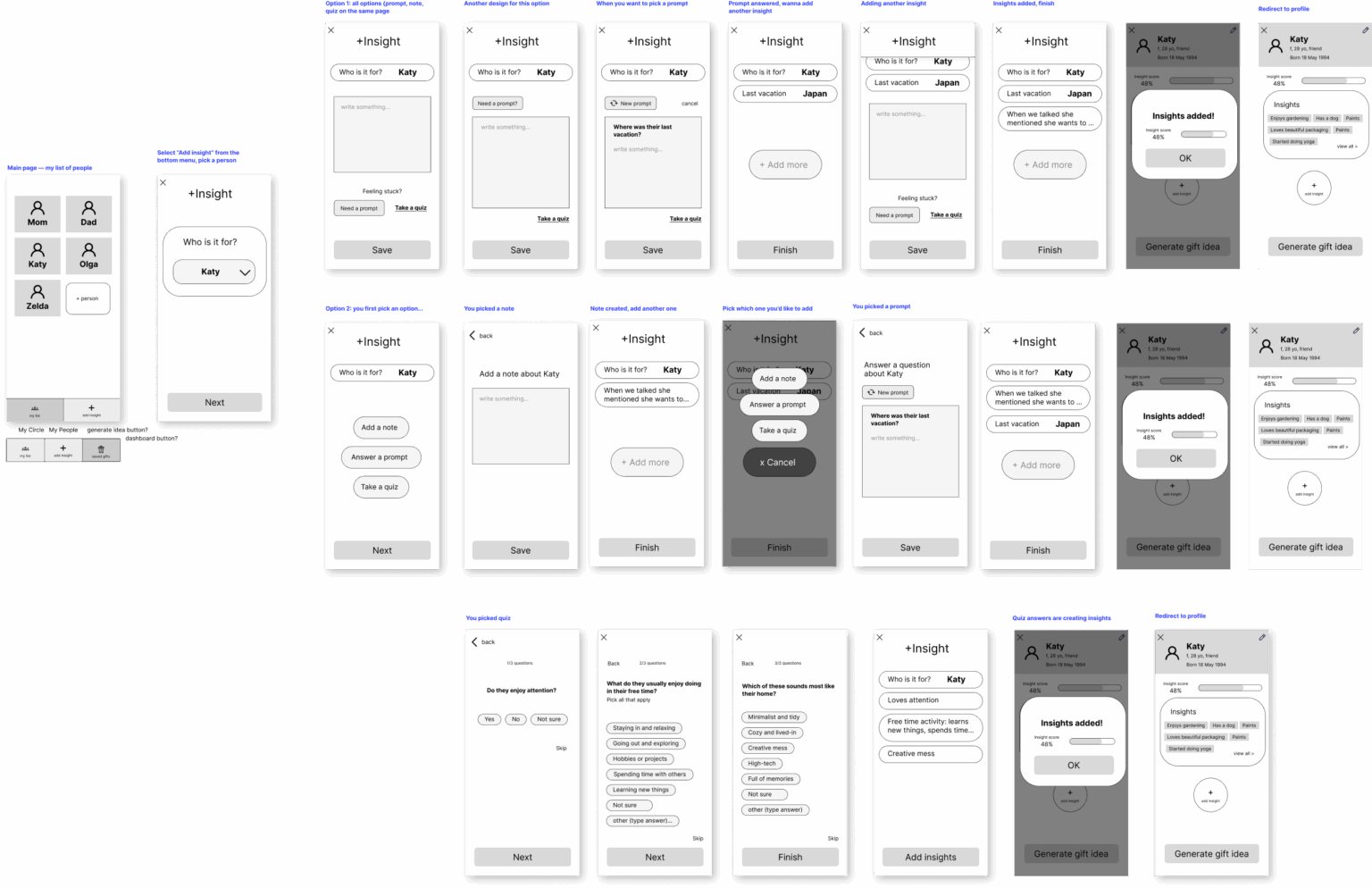
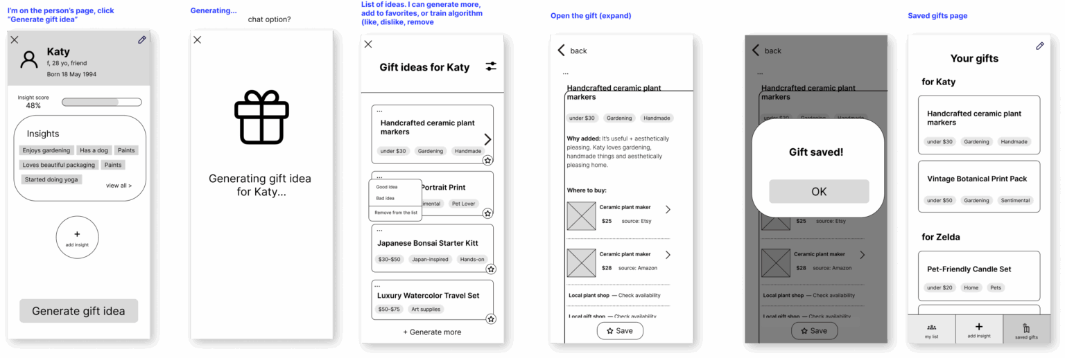
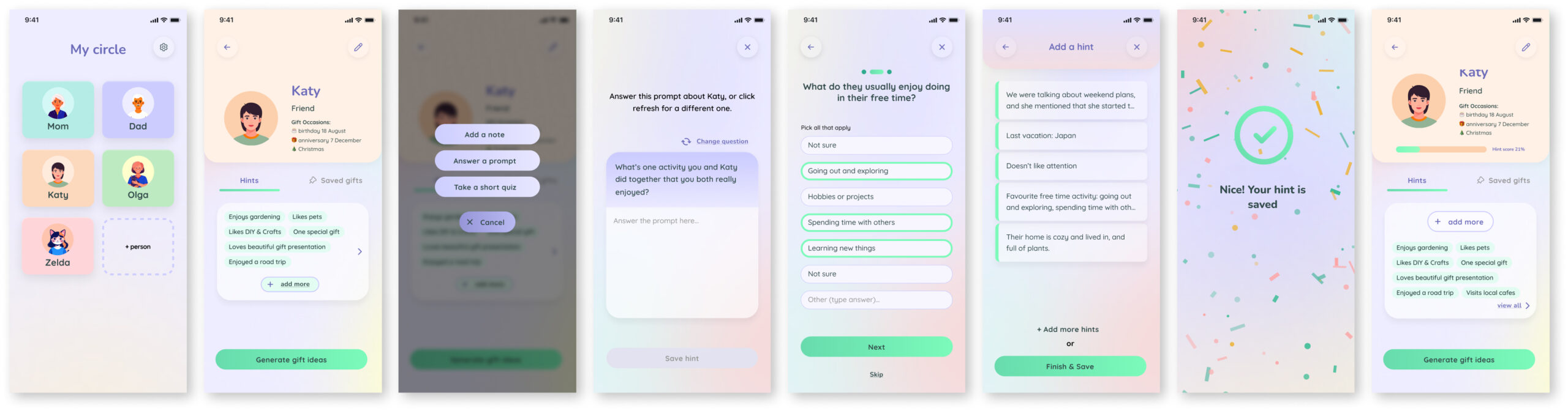
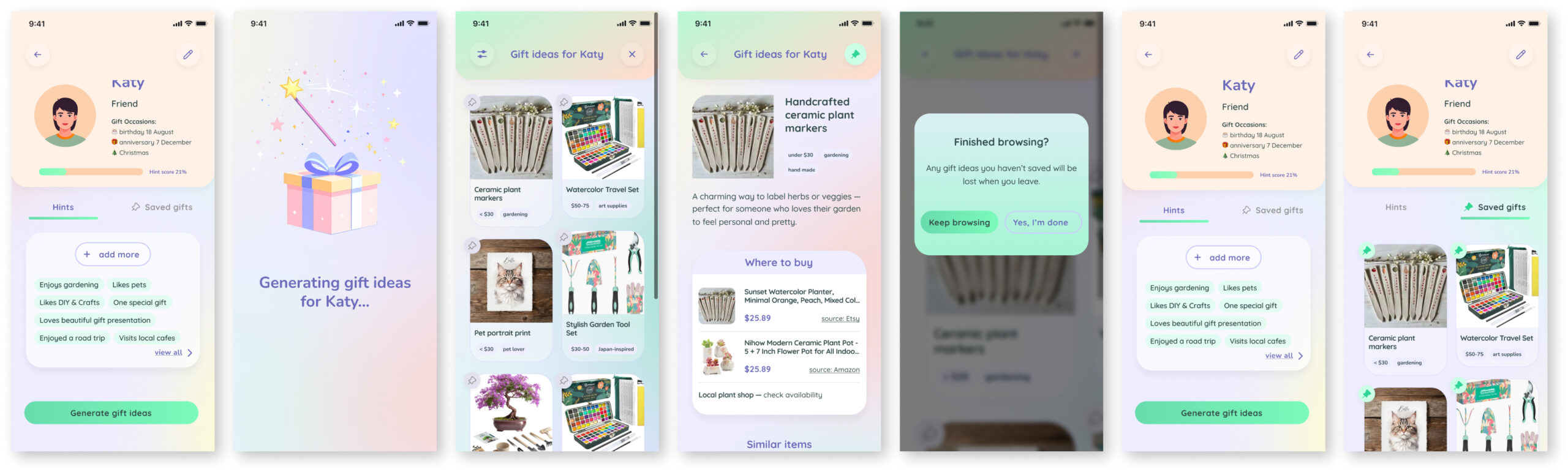
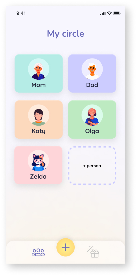
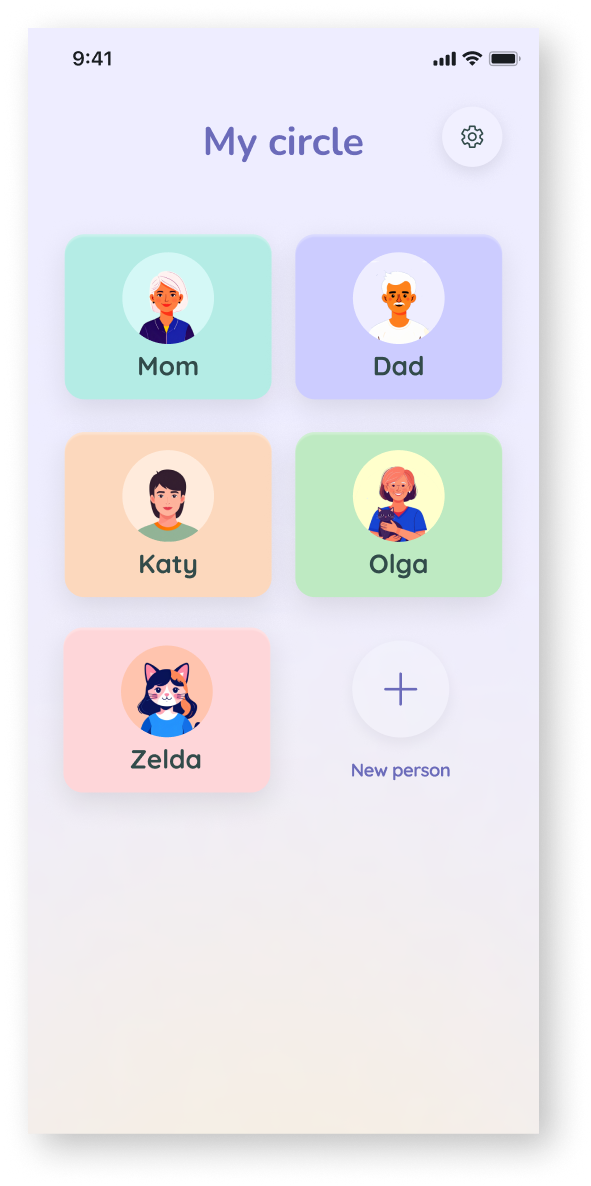
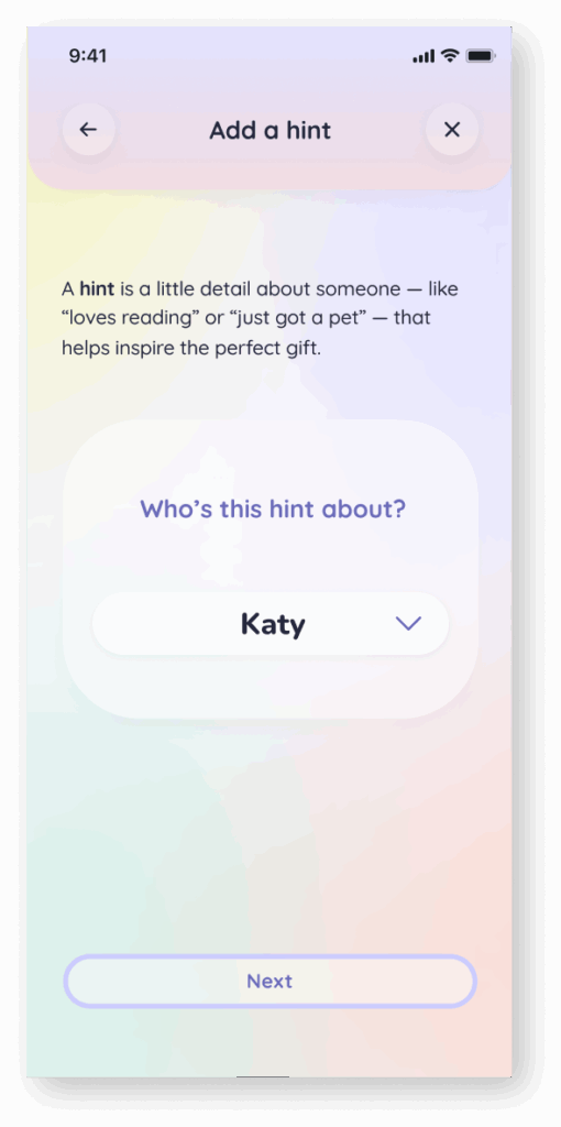
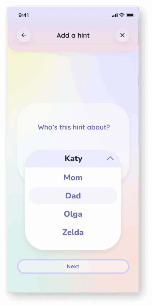
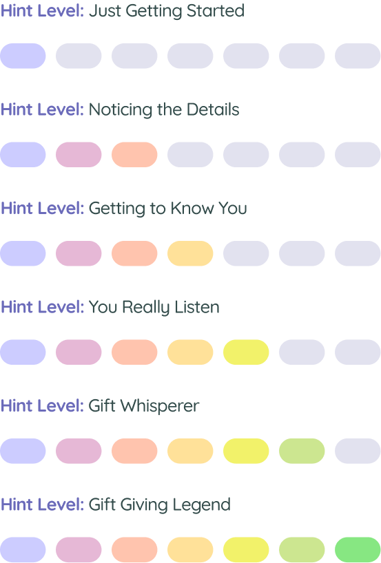
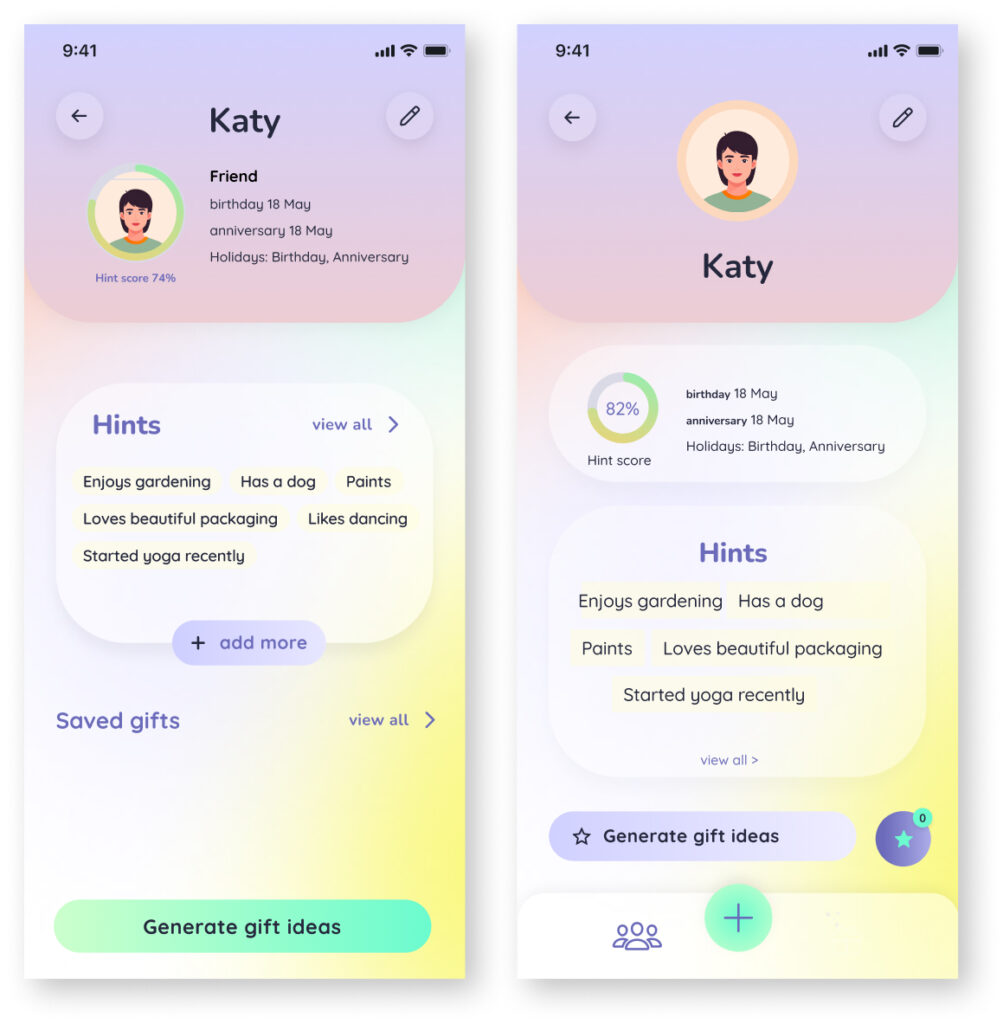
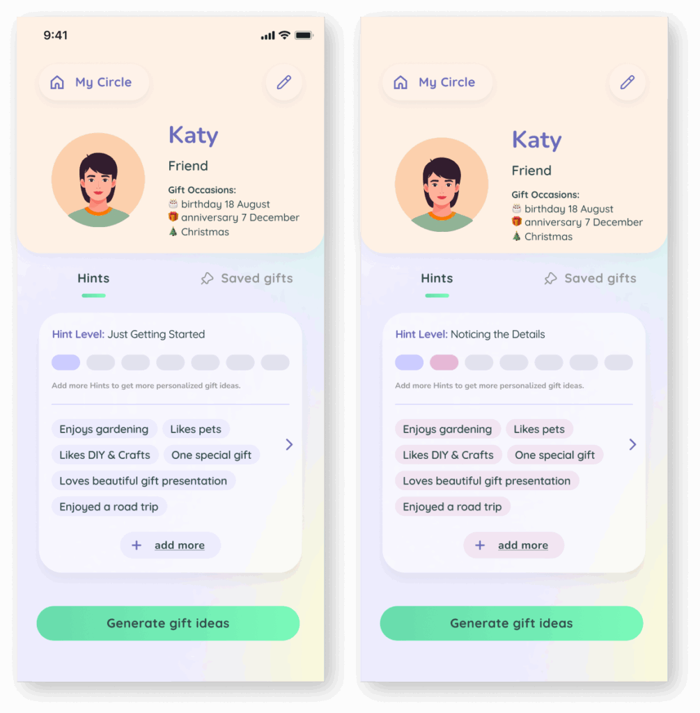
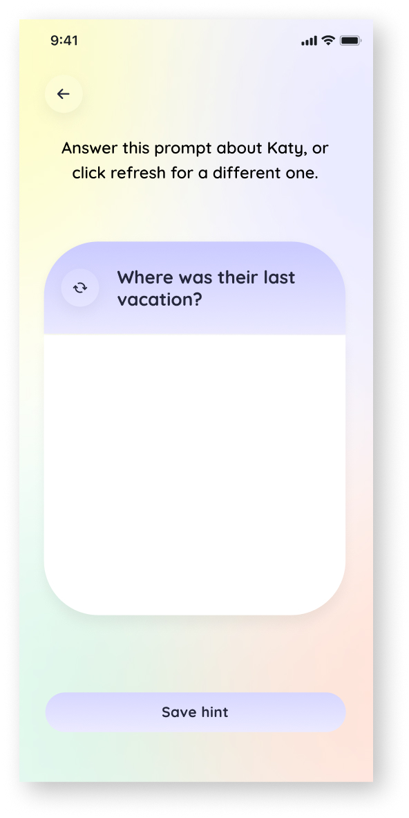
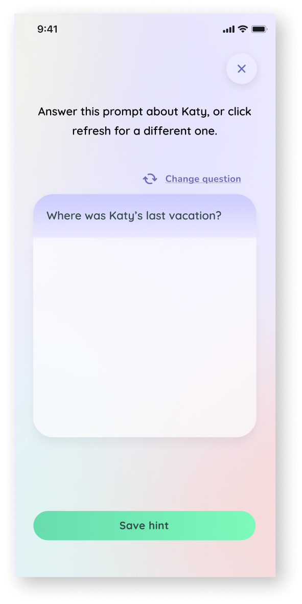
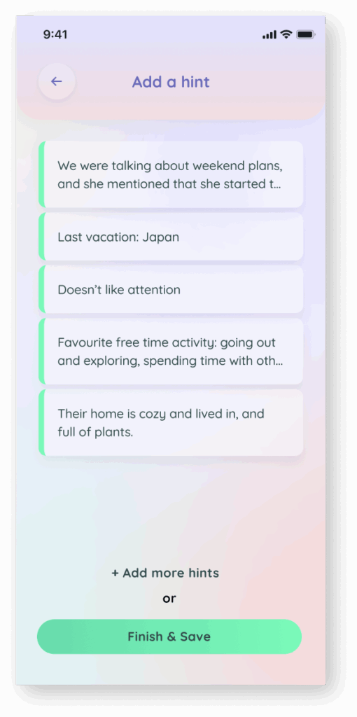
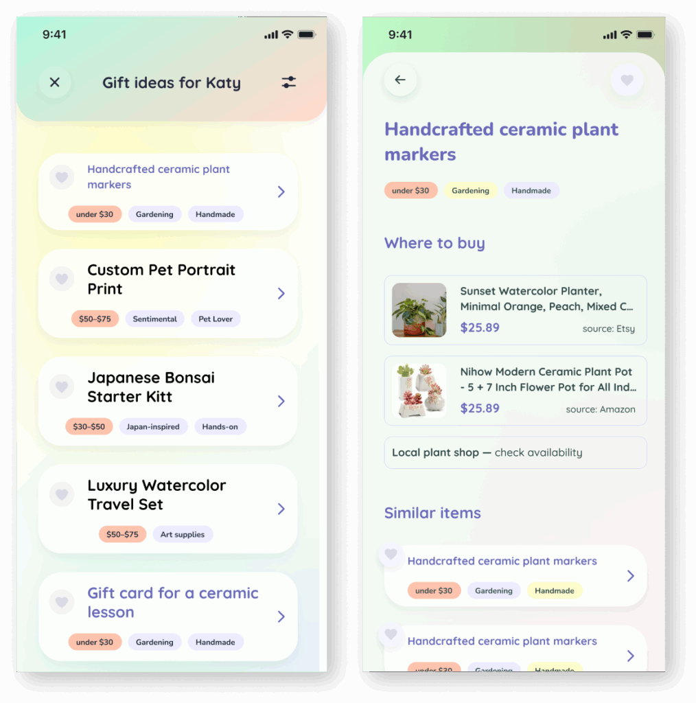
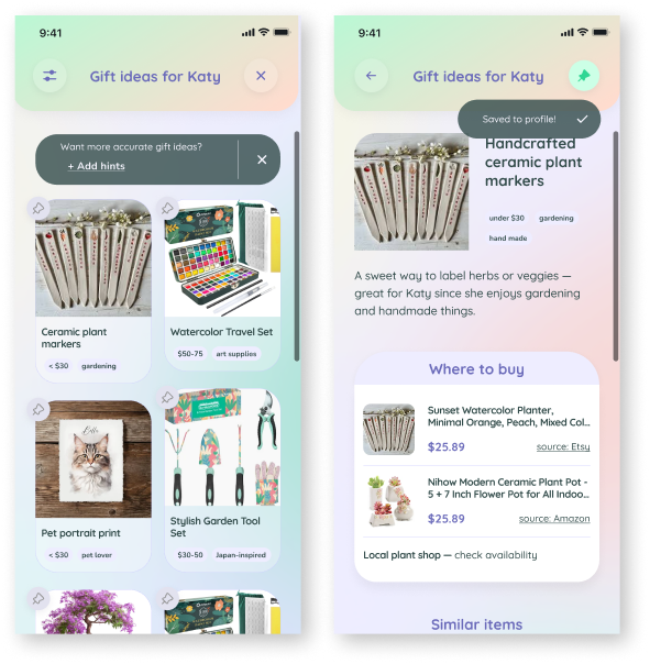
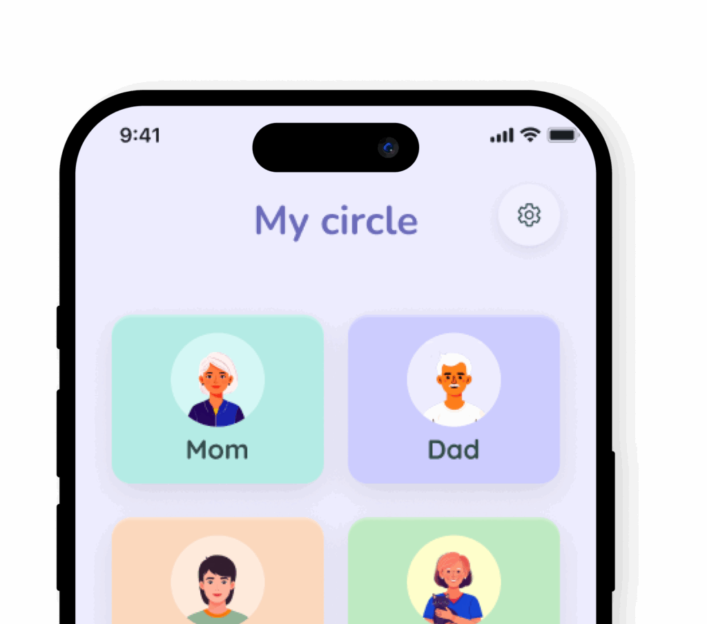
This case study explores a smart gifting app designed to help users give more thoughtful, personalized gifts by capturing small insights about their loved ones.

Date: Mar 2024 – May 2025

My Roles: UX Research, UX Design, Visual Design, Branding

Software: Adobe Photoshop, Adobe Illustrator, Figma

Date: Mar 2024 – May 2025

My Roles: UX Research, UX Design, Visual Design, Branding

Software: Adobe Photoshop, Adobe Illustrator, Figma

Background

Gift giving can be stressful — both for the giver and the receiver.

People often feel unsure what to give, especially if they don’t know the person well. On the receiving side, people don’t always get what they actually want, but feel too awkward to ask for something specific.

Traditional registries (like wedding or baby shower ones) are seen as acceptable in certain situations, but they aren’t widely used outside of that.

User research

Research goal

To explore how people experience giving and receiving gifts, what causes stress or ease, and how they feel about wishlists, group gifting, and sharing preferences — to see if there’s room for a tool that simplifies thoughtful gifting or requesting.

Research assumptions

  • People enjoy giving gifts
  • Asking for what you want feels awkward or unfun
  • Picking the right gift is stressful, especially last minute.Group gifting is hard to organize.
  • Wishlists feel too formal for most situations
  • There’s pressure to get the “perfect” gift.
  • Gifts often miss the mark on what people actually want

Research methodology

Primary:

  • User interviews (6 participants)
  • Online survey (30 respondents)

    Secondary:

  • Competitive analysis of AI gifting apps
  • Informal review of existing articles and studies on gift-giving psychology, social norms, and emotional dynamics

Competitive analysis

Competitive analysis insights

Event-Based Focus

Most tools center on wishlists or specific holidays/events.

Basic Features

Common tools only offer save/share lists or simple suggestions.

Shallow Personalization

Suggestions lack emotional tone, nuance, or gifting style.

Short-Term Use

Designed for one-off use — not meant to support ongoing relationships.

No Learning or Memory

Tools don’t build recipient profiles or adapt over time.

AI Feels Cold

AI gift apps are fast, but impersonal and often irrelevant.

Low Adoption

Many tools are niche, with limited use or retention.

Market Opportunity

A clear gap for a thoughtful, emotionally aware tool with long-term value.

User intreviews

6 users, 20-40 min interviews

After talking to users, I sorted their answers into a few clear themes.

😖 Pain Points

Gift giving can cause anxiety in case of unclear preferences, the recipient is difficult to shop for, or last minute pressure.

It’s stressful if you don’t know what to get.

She doesn’t give good ideas... it’s hard to get her something fun.

I suck at guessing what people want.

I get anxious when I think it might be a waste.

Giving gifts honestly makes me anxious… I’m afraid to just add to the clutter.

Receiving unwanted gifts leads to guilt and disappointment.

I feel guilty returning them too.

I would rather they just never bought me the gift.

It’s awkward when you know they spent money on something you don’t use.

Maybe I keep them for a while, until I feel I can finally get rid of them.

I don’t want to receive something and waste it.

Giving a gift that lands poorly is emotionally discouraging.

I once gave Li pajama pants and socks and he didn’t like it. I haven’t given him anything since.

It’s upsetting when someone doesn’t appreciate what you chose.

You try, but when it doesn’t land, it just feels discouraging.

I hate seeing something I gave someone just lying around unused.

Last-minute gifting increases stress and lowers satisfaction.

Last-minute stress is the worst... I just want to get anything.

I try to plan ahead of time so it’s not a rush.

I end up buying random stuff that maybe isn’t the best.

🧠 How People Choose Gifts

People rely on personality, hobbies, and recent comments.

I gave something funny because she likes Spam.

I look at how people give gifts and give the way they do.

You already know... she’s into gardening, so you can buy something along those lines.

I base it on what they’ve been into lately... like if they’ve mentioned a new hobby.

Lucas is a really good gift giver — he focuses on what people enjoy.

People prefer to guess and observe rather than directly ask.

If I hear someone mention something they need, I try to remember it.

I go off what they’ve mentioned recently — something small or random.

I just guess based on what they talk about.

I hate asking... I like figuring it out on my own.

You kind of just get a feel based on what they’re into.

📋 Wishlists & Registries

Wishlists and registries are useful in formal or practical contexts.

For weddings or babies, they make total sense.

Registries are helpful... it makes my life easier.

Wishlists are great, no chance of disappointment.

You can see what’s already bought, so it’s organized.

It’s good when you don’t want your money wasted.

But in personal settings, people feel awkward using or sharing them.

I like surprises... I’d rather not use a wishlist.

It feels entitled to ask for things.

I don’t like wishlists... there’s no freedom, it’s restricted.

I think a gift list is weird, even if it aligns with my utilitarian ideal.

💝 Emotional Experience of Gift Giving

Gift giving feels rewarding when it hits the mark.

It’s positive — I don’t see it as a chore at all.

I love gifts!

It’s great whenever you nail a gift... it shows you understand them.

I enjoy looking for gifts, unless I’m having a hard time doing it.

It’s always enjoyable when it feels like they really liked it.

👥 Group Gifting Experiences

Group gifting experience varies — poor coordination can cause confusion and even resentment.

Group gifts are fine if it’s transparent.

We all pitched in for a tablet she really wanted.

It was easy to coordinate when my sister organized it.

I’m not really comfortable asking others to pool together for a gift.

I was left paying more... it wasn’t transparent.

🎁 Receiving Gifts

People hesitate to express what they want and prefer being surprised.

The most amazing part of getting gifts for me is like, you're getting surprised.

Even if someone asks, I just give a vague answer.

I prefer not to ask even when I need something.

I don’t want to seem entitled.

I like surprises. Even though I know, yeah... I've never really gone like, 'get me this specifically’.

It wasn’t something I directly asked for, but I had talked about it in the past.

I would never ask... it feels unnatural.

I usually don’t tell anyone. I like surprises.

I rarely ask... I think it’s less fun.

I would like my friends to know what I need… but it feels weird to tell them.

They’d rather get nothing than a meaningless or generic gift.

I’d rather get nothing than something generic.

I’d rather no one waste their money just to check a box.

I would rather they just never bought me the gift.

Survey

After completing user interviews, I ran a follow-up survey (30 respondents) to explore common behaviors and pain points around gift giving.

People enjoy giving gifts overall: average rating 5.5 / 7

But they’re less enthusiastic about searching for gifts:
average rating 4.0 / 7

Respondents feel unsure about what to get quite often: average rating 4.4 / 7

Strategy

User persona

Based on the research, I created a user persona to help guide design decisions throughout the process.

POV & HMW

A Point of View (POV) statement is the next step in my process. It helps reframe the design challenge into something more focused and actionable — something I can start building solutions around.

A strong POV combines three key parts:

  • User — who I’m designing for
  • Need — what they need
  • Insight — a deeper understanding of why that need exists

Once the POV is clearly defined, it sets the stage for brainstorming meaningful ideas and solutions.

POV 1:

I’d like to explore ways to help thoughtful but anxious gift givers find meaningful gifts without getting overwhelmed, because relying on vague hints and intuition often leads to second-guessing and stress.


  • How might we guide overwhelmed givers toward thoughtful options without endless scrolling or second-guessing?
  • How might we help people keep track of gift ideas throughout the year, based on small hints and observations?
  • How might we reduce the mental load of gift giving for people who feel pressure to “get it right”?

POV 2:

I’d like to explore ways to help gift givers understand what recipients want without making it awkward, because people avoid direct conversations about gifts — leading to missed signals and mismatched expectations.


  • How might we help people share what they want without feeling like they’re asking for something?
  • How might we make it socially normal — or even fun — to share gift preferences in everyday relationships?
  • How might we make it easier for gift givers to ask what someone wants without putting pressure on them to answer?

Ideation

Brainstorming

Brainstorming is the most fun part of the process for me, and I love using various brainstorming techniques.
I’ve given myself a time limit — 20 minutes — and the goal to create as many ideas as I can, no matter how bad or absurd them might seem. I used various techniques — like “Bad ideas only” — and generated multple ideas. Picked the more interesting ones:


Final idea

Feature list

As I developed the idea and looked at my user persona, I made a list of features I’d want in the app.
I organized them into categories and picked out the most important ones to focus on for the MVP.

Interaction

Sitemap

The sitemap outlines how all pages and content connect across the site, making it easier to plan the structure and explain the navigation logic.

User flow

I focused on the process of generating gift ideas, mapping out key decisions and actions the user takes along the way.

Task flows

For this MVP and based on the prioritized feature list, I outlined three essential flows: adding a person, adding an insight (or “hint”), and generating a gift.

Low-fidelity wireframes

Looking at my persona and referencing the task flows and sitemap, I began sketching out low-fidelity wireframes. I prefer working in Figma, using basic shapes and grayscale to focus purely on structure, user flows, and interactions — without getting distracted by UI details.

This approach makes it easier to test ideas, quickly make changes, and even add simple interactions using the prototype tool when needed.

Task flow 1: add an insight from main page

This flow branches into several different ideas, that I tested with users.

Task flow 2generate gift ideas and save the gift

Design

Branding

Branding plays a key role in this project, since it’s built around an emotional experience. The design needs to reflect the thoughtfulness and sentiment behind gift giving — creating a warm, personal, and emotionally resonant user experience.

My design process always begins with identifying the brand’s values and emotional tone. I focus on the feeling I want to evoke and the visual language that helps bring that to life.

Values: Connection, Care, Memory, Effort, Delight

Style: Playful, warm, modern with nostalgic touches

Elements: Pastel color palette, soft rounded shapes, expressive microcopy, gift-inspired visuals (wrapping, tags, ribbons), confetti accents, joyful typography, minimal cards with emotional tone

Inspiration board

Inspiration board

Logo design

Sketching logo ideas

Final logo

Colors

Typography

UI Elements

Prototyping & testing

High-fidelity wireframes

Showcasing key screens across the experience, rather than illustrating full user flows.

Onboarding and login flow

Adding a person

Adding a Hint

Generating gift ideas

Usability testing

After completing the prototype, I ran usability tests with 4 users, alongside smaller targeted tests involving 11 participants in total.

4 users, 2 flows:

  • onboarding + creating a person
  • adding a hint (using all 3 functions: note, prompt and quiz)
  • generating gifts and saving two of them


Metrics:
Task is completed easily and every step is clear to each participant.

Key Findings

  • Visual design was consistently praised.
  • Users said they’d actually want to use an app like this.
  • Simplicity and clarity of the interface stood out.

Approach

  • I observed how users interacted with the design without guidance, paying close attention to whether they could complete tasks based on intuitive flow.
    • When unsure about a feature’s design or placement, I:
    • Showed two variations for comparison.
      Asked users how they would naturally complete a task, without specifying what I was testing.

Removed screens

Dropped screens after testing showed they weren’t needed. Since I removed the universal “Add” button” there was no need for choosing who is the hint about.

Iterations summary​

There were a few smaller tweaks — like adjusting icons, button styles, and colors — as well as some bigger shifts.

For example, I decided to remove the bottom navigation and move toward a single-page app structure with deeper, contextual navigation.

Before

After

Removed bottom menu, changed colors, revised the icons

Removed Screens

Dropped screens after testing showed they weren’t needed. Since I removed the universal “Add” button” there was no need for choosing who is the hint about.

Removed:

Menu re-design

Focused on clarity and hierarchy:

  • Made “Generate Gift” the most prominent button
  • Styled “Add More Hints” to visually match core actions
  • Created a tab for “Saved gifts” since it’s an important feature

Hint Level Update

  • Replaced percentage-based “Hint Score” with more human “Hint Level”
  • Introduced color-coded progress instead of numbers
  • Reflects the idea that you can’t fully know someone

Before (2 versions):

After:

Final prototype

More user friendly screens

I updated the ‘Change Question’ button to make it more noticeable, after observing that some users missed it.

Before

After

Removed unnecessary elements that create visual clutter but don’t help user experience.

Removed:

Generated Gifts re-design

Redesigned the Generated Gift Ideas list:

  • Switched to two-column layout for better visibility and less scrolling
  • Added images to make the list more engaging and visually appealing
  • Updated colors for improved hierarchy and clarity

Introduced toast notifications:

  • Prompt to add more hints from the list view
  • Confirmation when a gift is saved to a profile

Before:

After:

Back To Top