This case study explores a new Google Maps feature designed to help users with dietary restrictions more easily find restaurants that meet their needs.
Date: Feb 2024 – Mar 2025
My Roles: UX Research, UX Design
Software: Adobe Illustrator, Figma
Background
Google Maps is used by over 2 billion people every month to find places and restaurants. Despite its many features, it doesn’t offer an easy way to filter spots by dietary needs.
This gap is significant considering that dietary restrictions and preferences are increasingly common. In 2022, over half of U.S. adults said they stick to diets like vegetarian, vegan, or gluten-free.
Right now, people have to search manually or check menus and reviews, which takes time and isn’t always reliable.
This case study presents a new Google Maps Food Restriction Filter to solve this problem.
Research
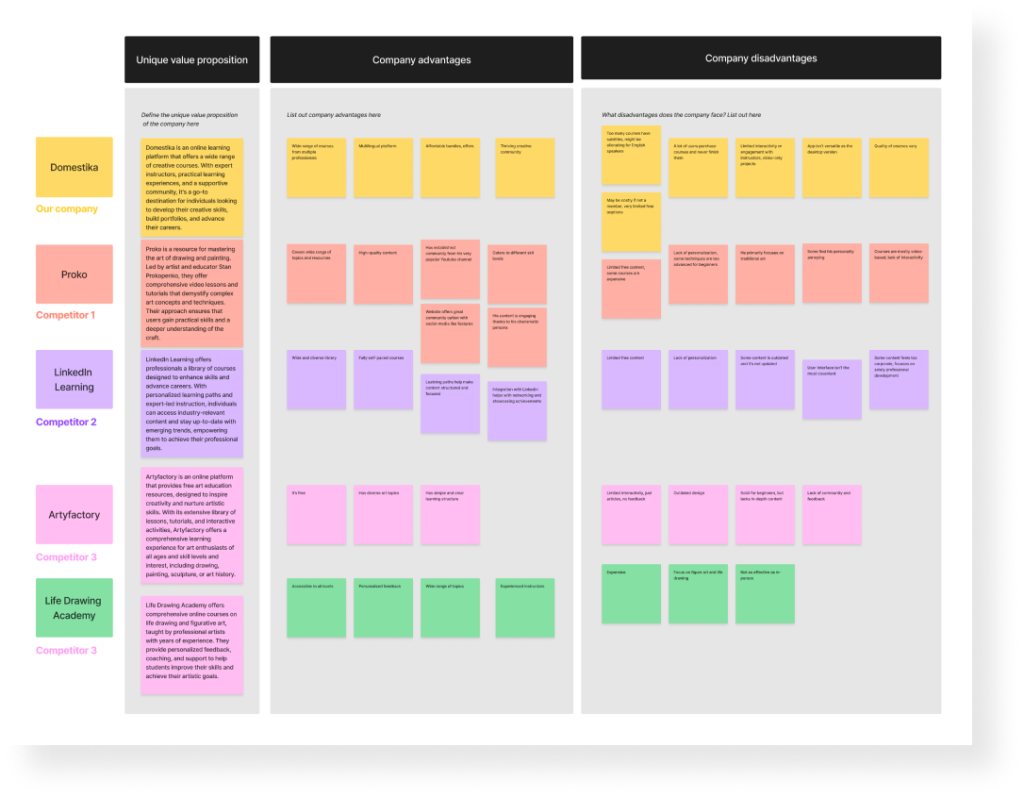
Competitive analysis
Insights
There is a wide range of available online resources with the diverse range of topics
Those with a community base are more popular
Common disadvantages include limited interactivity, lack of feedback, narrow focus, ineffectiveness
Self-taught artists value resources from a specific personality, rather than a platform
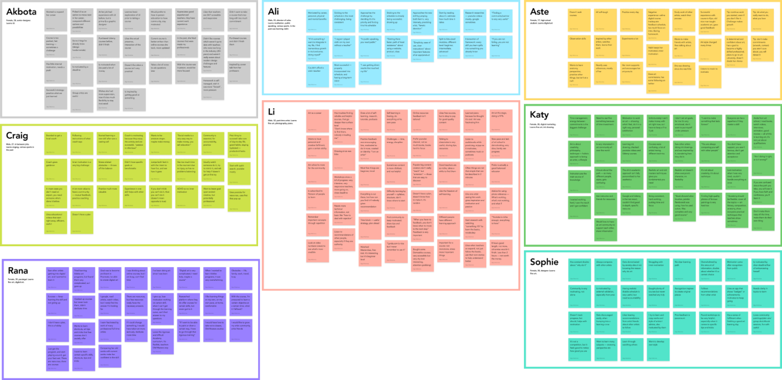
User interviews
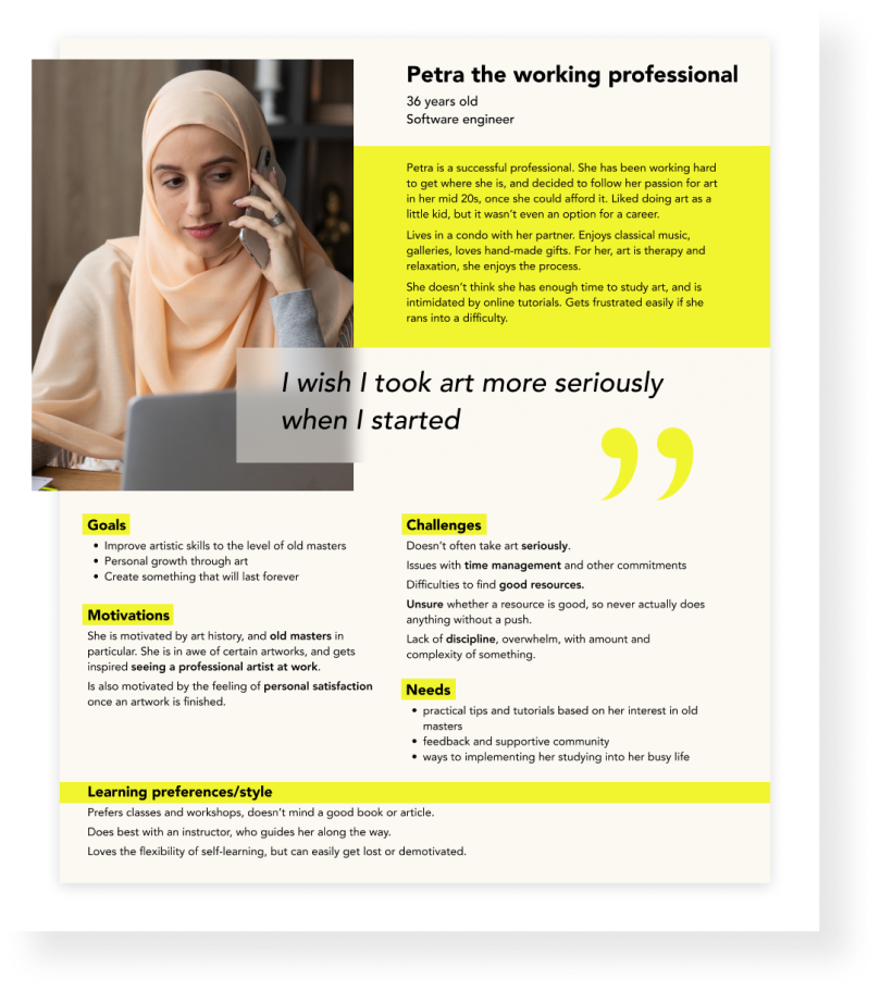
Conducted interviews with 5 artists and 3 non-artists Requirement: experience with self-learning a new skill Age: 17-39 yo
Affinity map
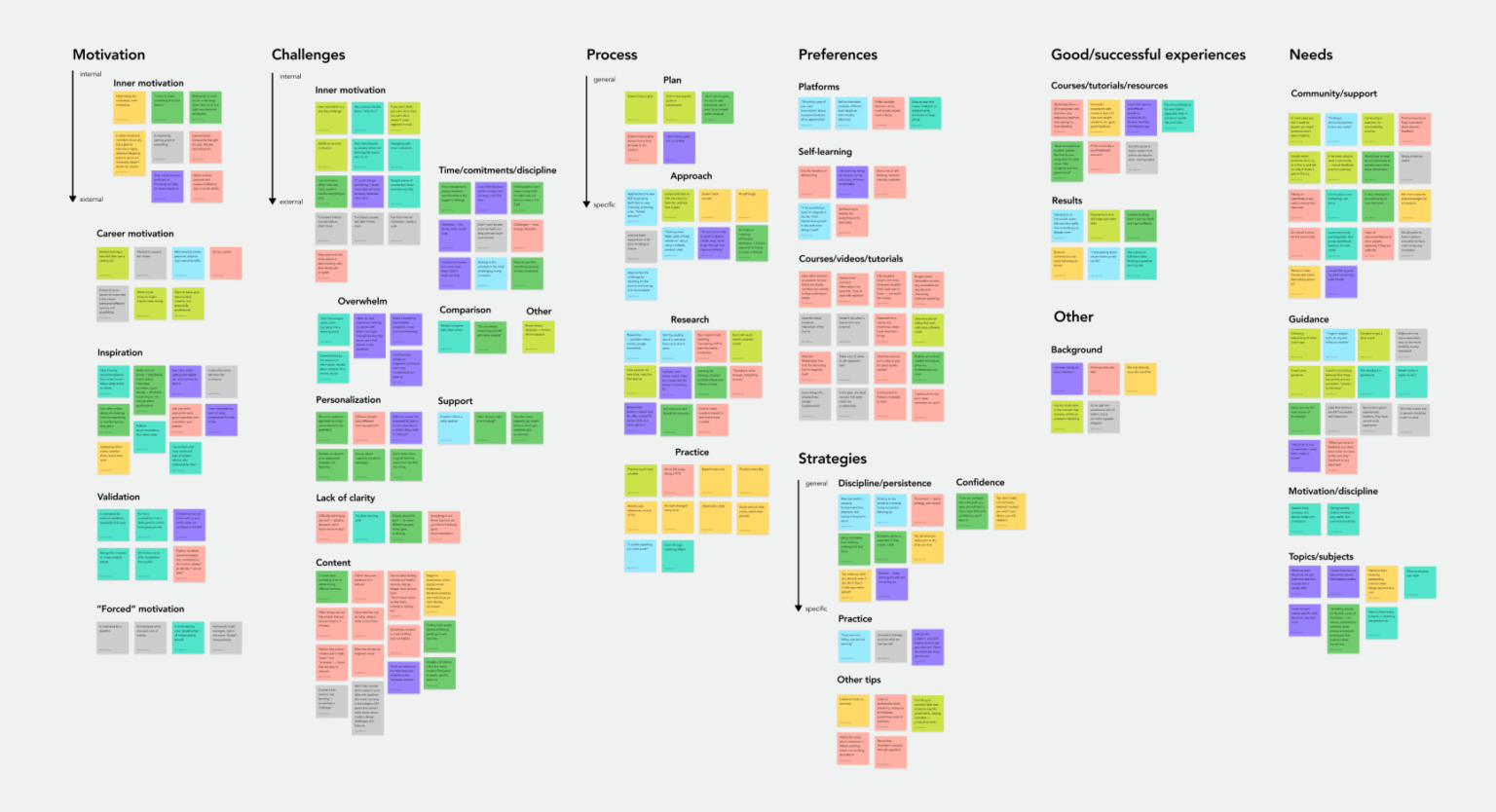
Key takeaways
Need for guidance and community
Problems with inner motivation
Time management and discipline challenges
Users never have clear goals and set up a learning path
Strong need for external motivation
Successful strategies: effort, practice, discipline, incorporating the learning process into daily life and schedules
Mostly negative experience with learning resources: surface level, poor quality, aimed at beginners, overwhelming, hard to continue doing once started
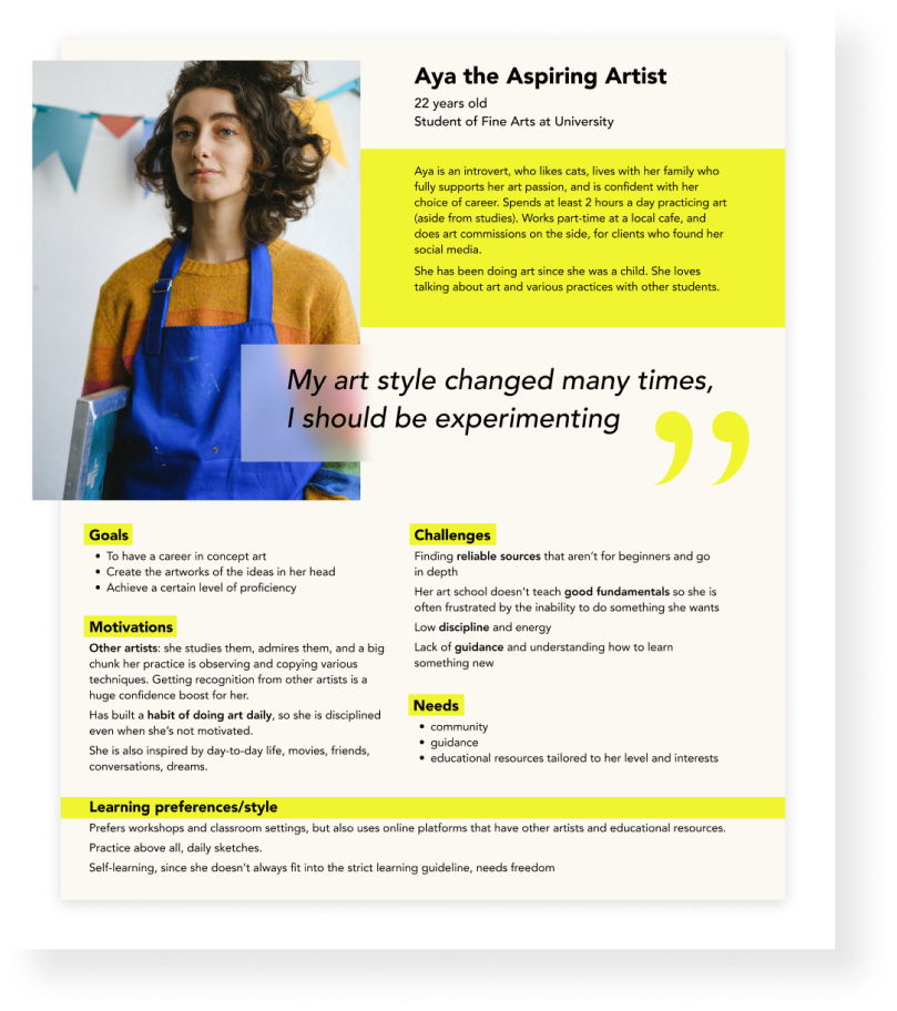
User personas
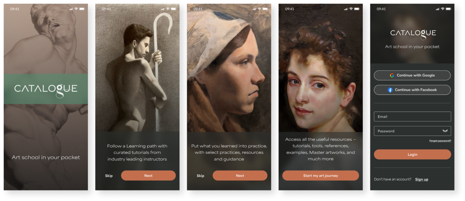
Solution
Feature Roadmap
I created a list of features to ensure the minimum viable product, prioritizing the key features of the product — Learning Section, Path and Practice. At the same time, it’s important to outline more features that can be developed in the future, to fit the User and Business needs.
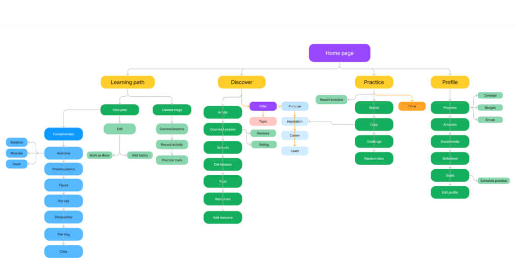
Sitemap
Sitemap with a major features that allow the user to
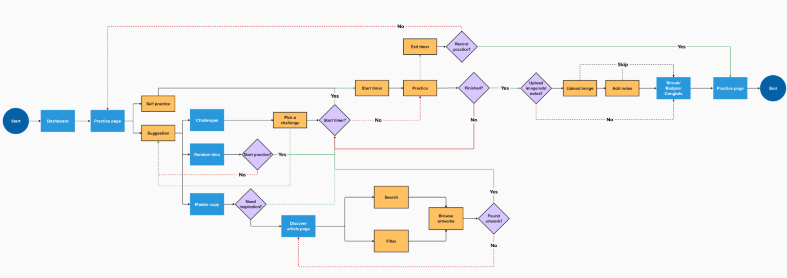
User flows
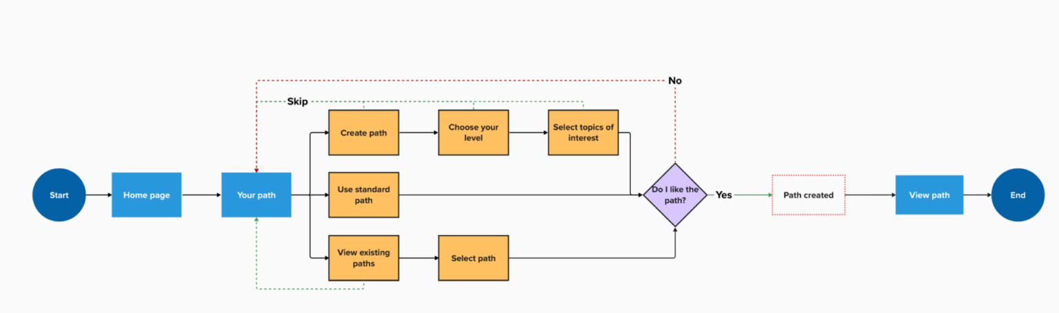
User Flow 1
Set up path
User Flow 2
Find a lesson
User Flow 3
Start a practice
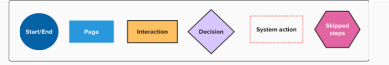
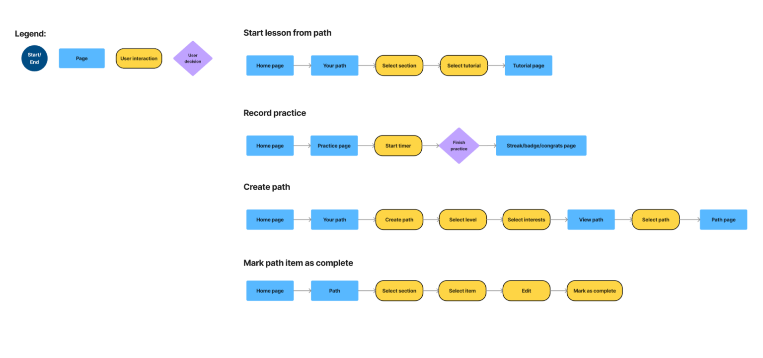
Task flows
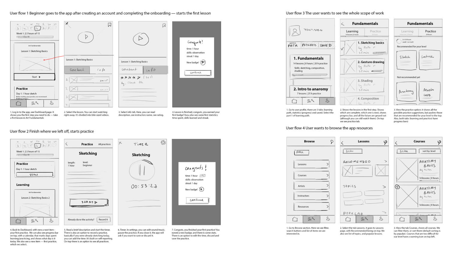
Wireframes
Low-fi wireframes
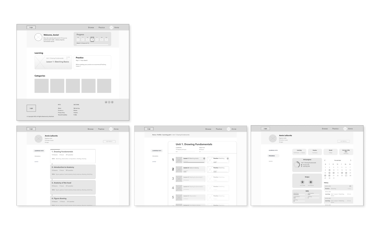
Mid-fi wireframes
Mid-fi desktop wireframes
Visual design
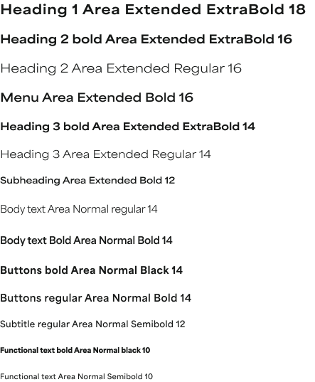
Typography
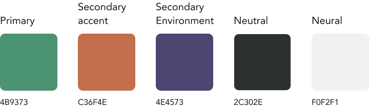
Colors
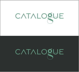
Primary logo
Secondary logo
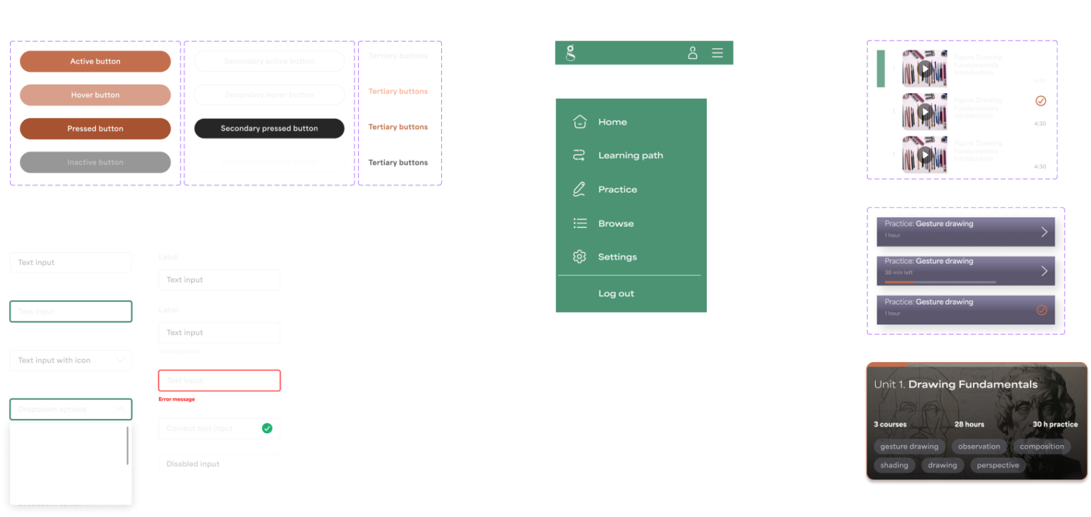
UI elements
Prototyping & Testing
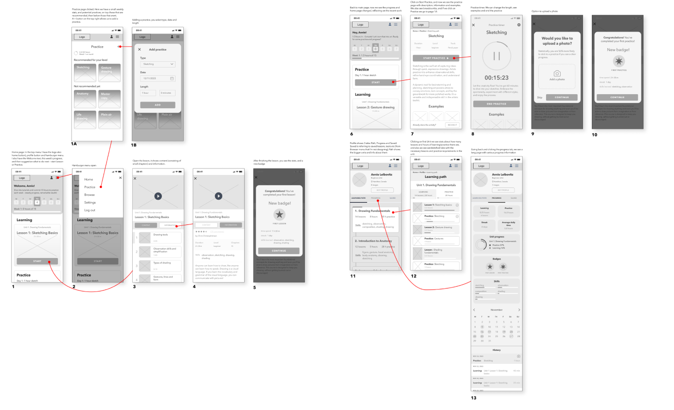
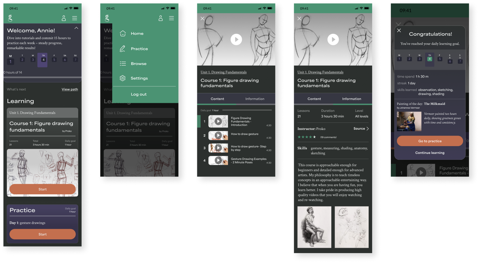
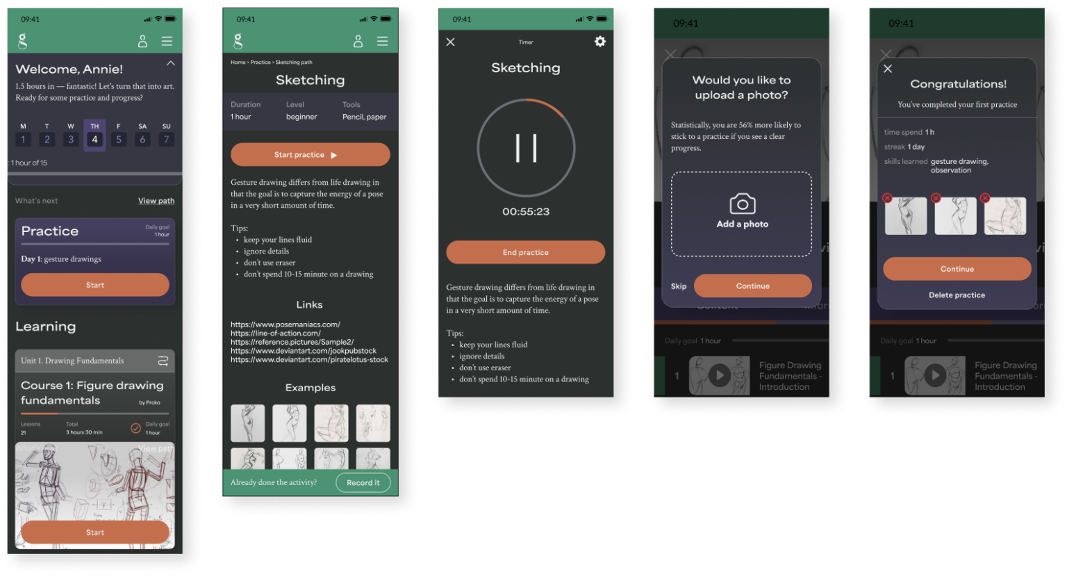
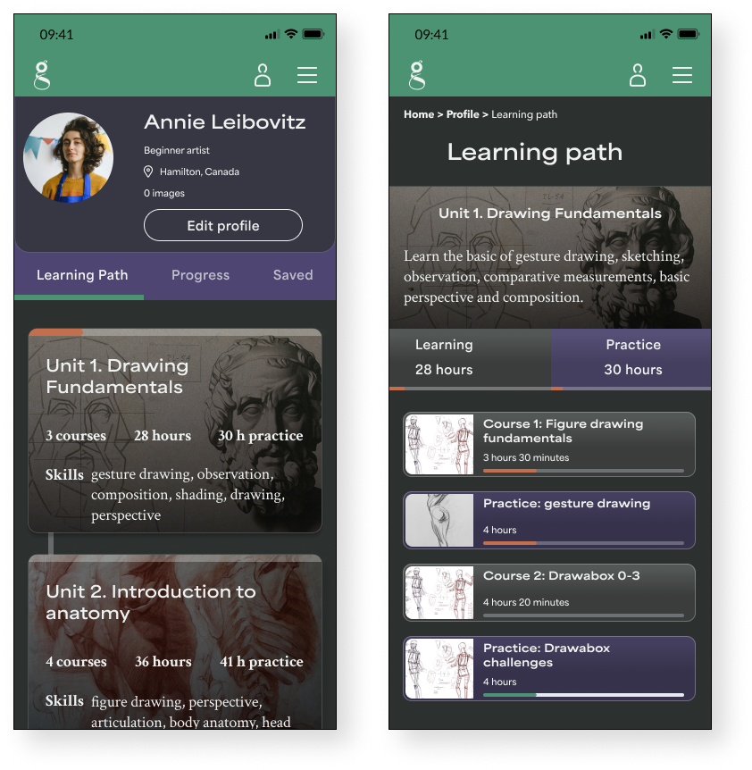
High fidelity wireframes
HI
Task Flow 1
Initial login after onboarding, watching the first lesson suggested by the dashboard
Task Flow 2
Start the first practice
Task Flow 3
See the Learning Path
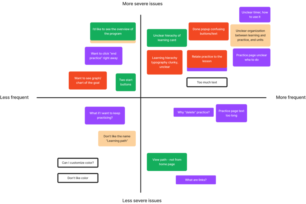
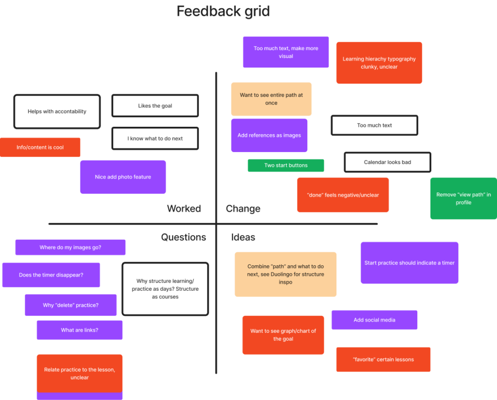
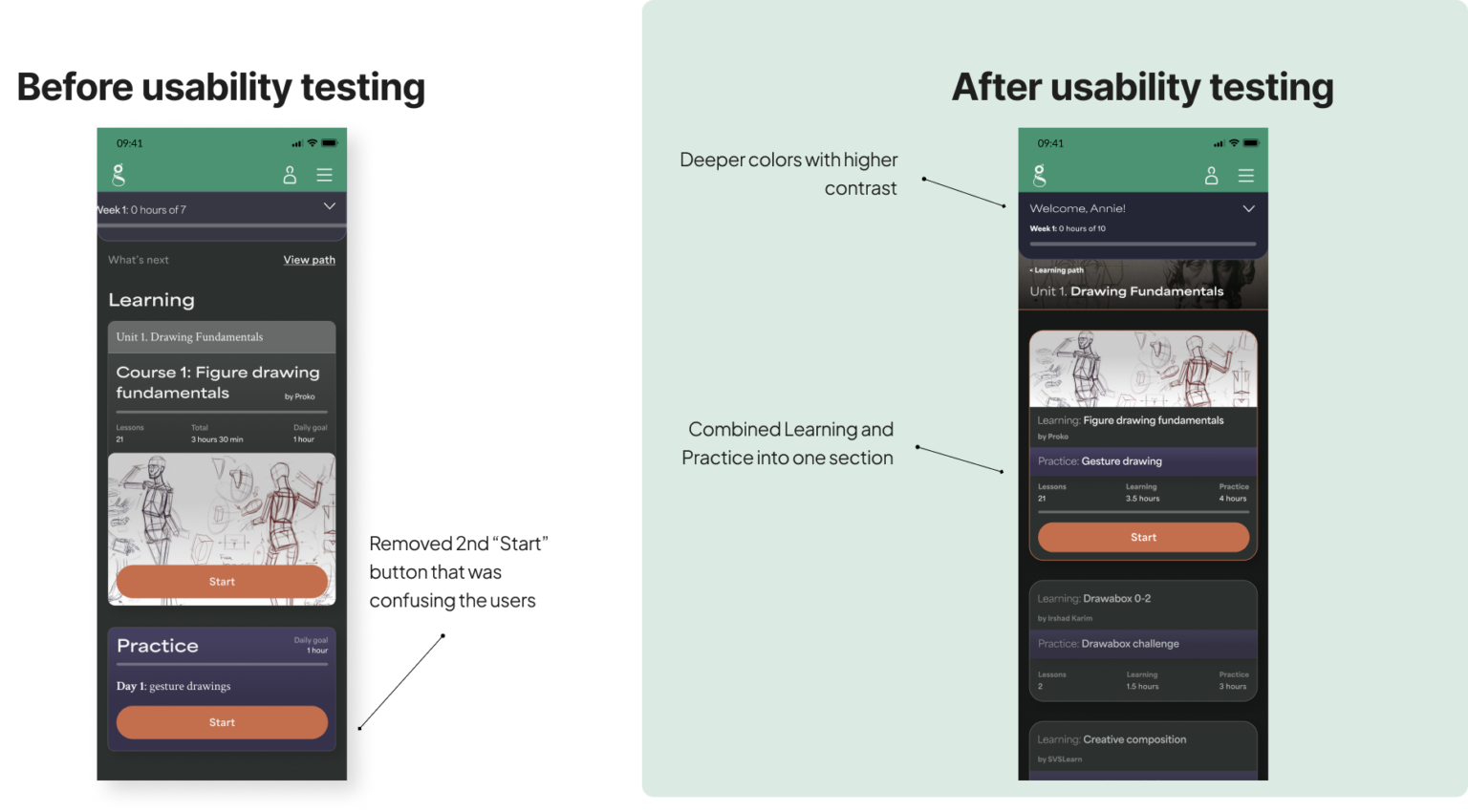
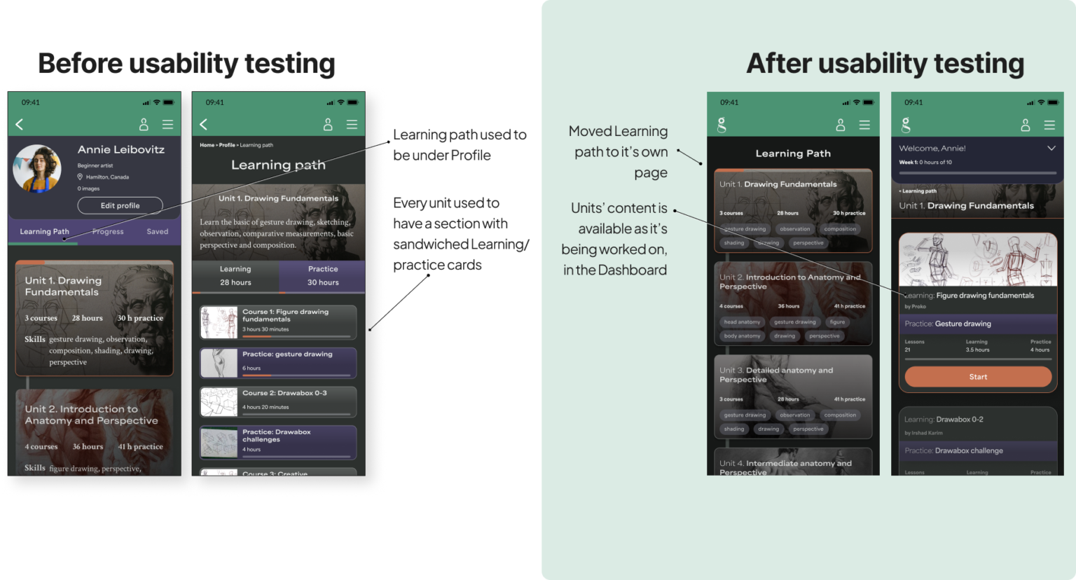
Usability testing
5 participants, 2 tasks:
complete the first Learning unit
complete the first Practice
Metrics:
Task is completed easily and every step is clear to each participant
Recommendations:
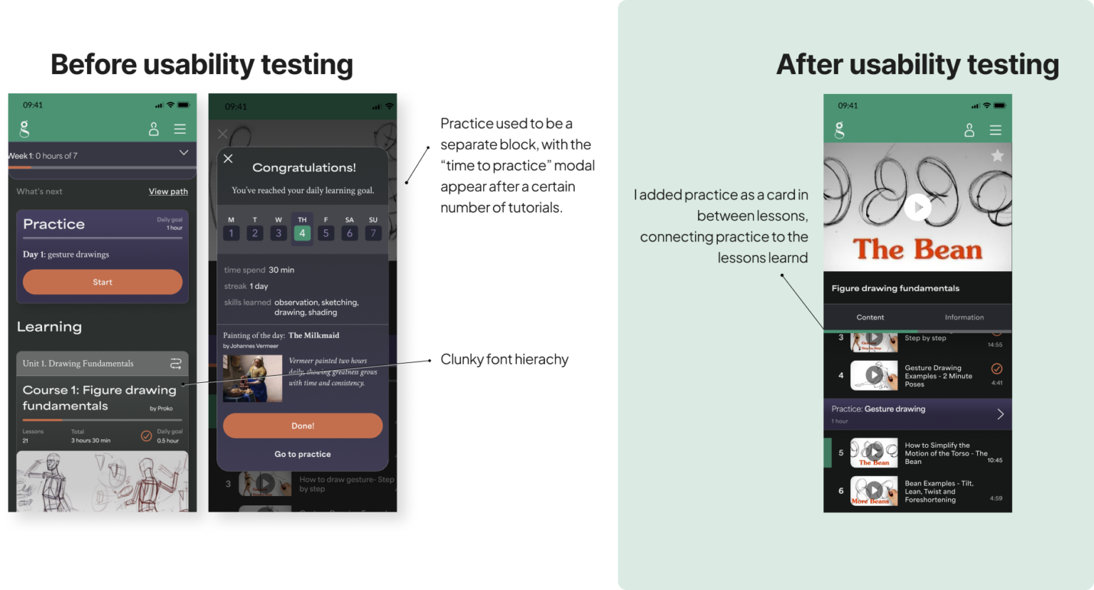
improve the structure of Learning path, combining the Learning/Practice relation
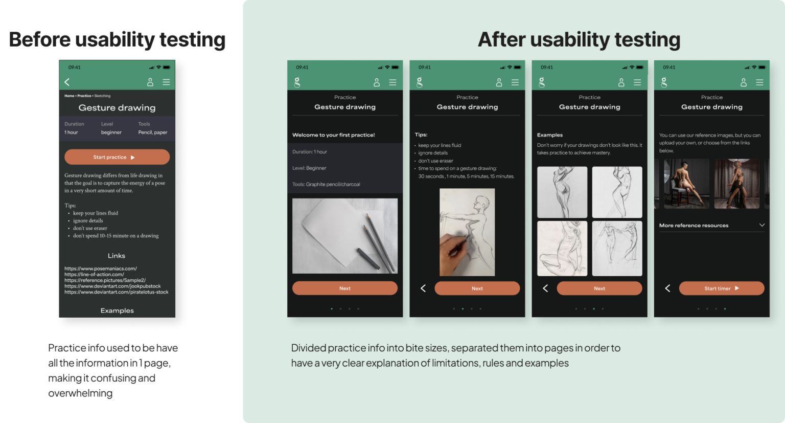
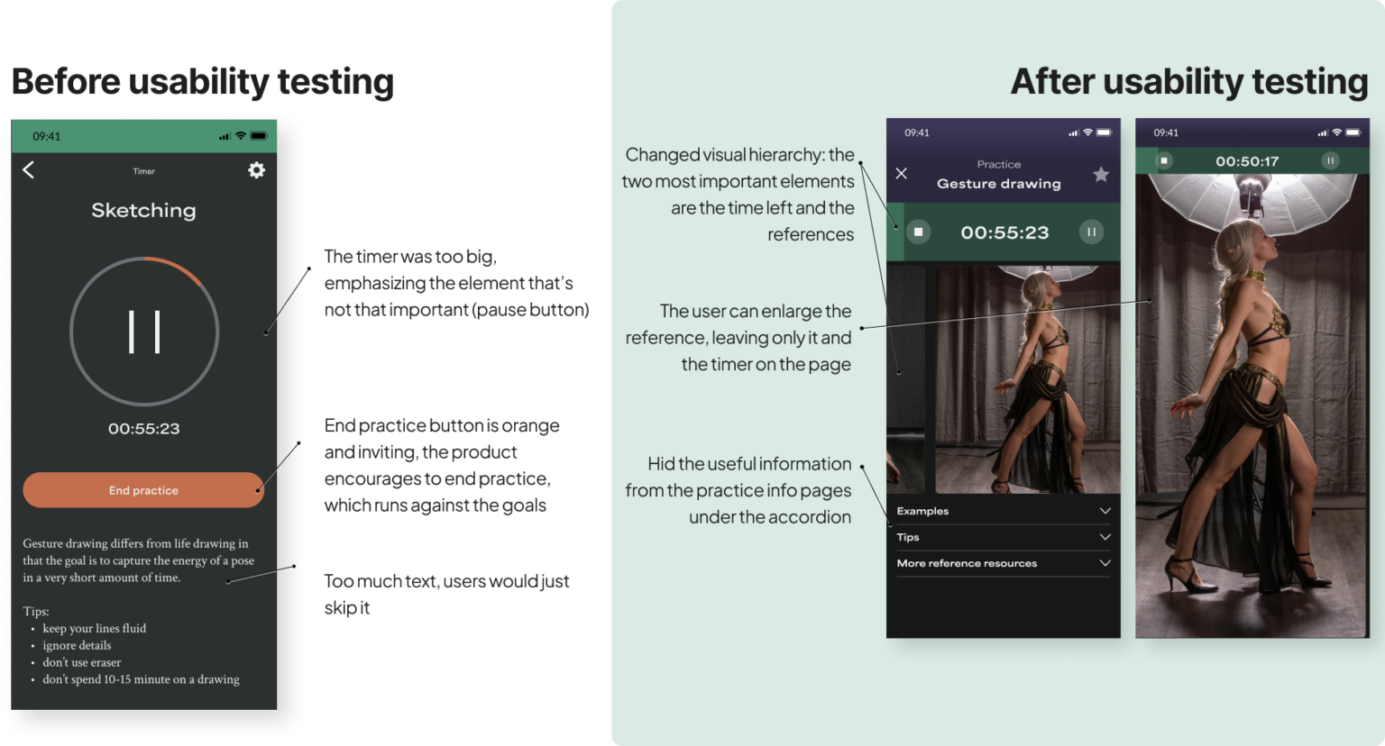
re-organize the Practice page: make more visual, make the function of it clear
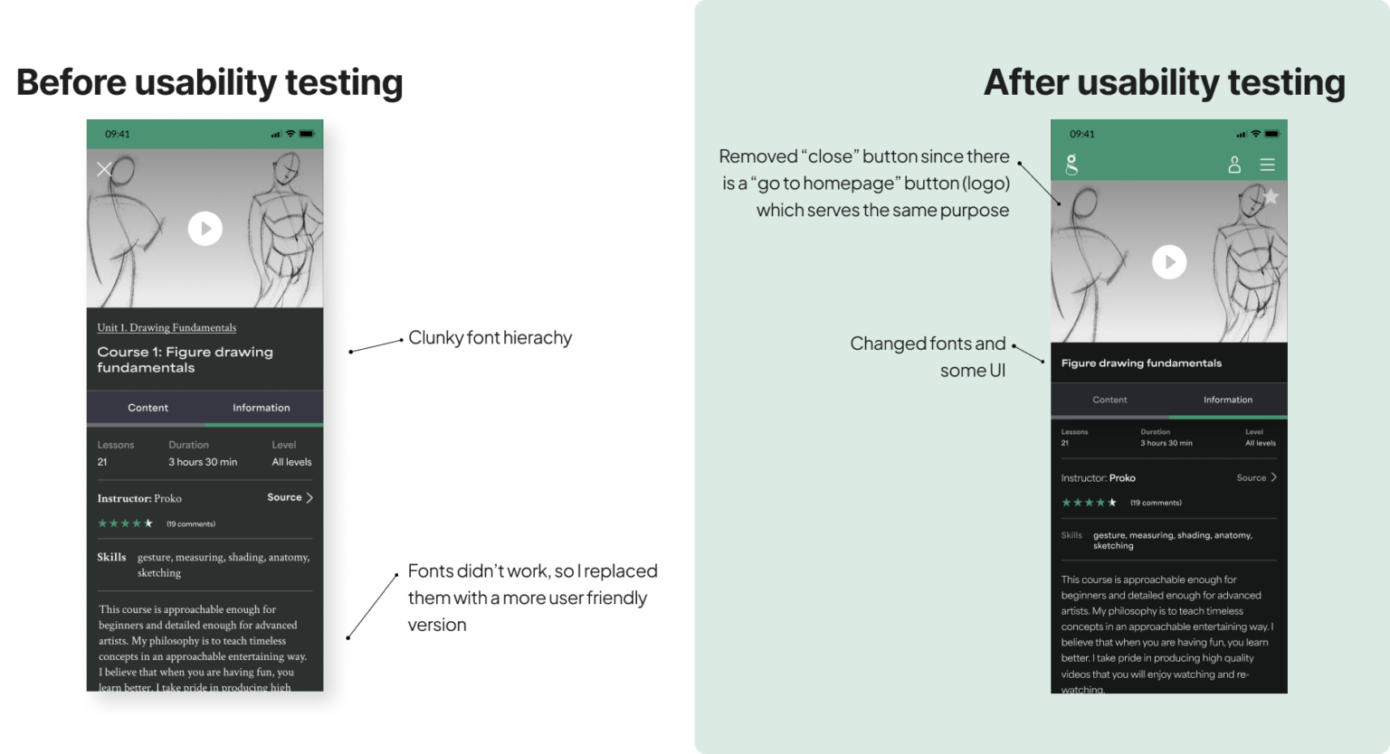
reduce the amount of text used throughout the website
work on typography/hierarchy of text elements
make less rooms for user freedom, and make the steps they take inevitable